I-ACTIV
VISUAL IDENTITY, MOTION DESIGN, AND WEB SUPPORT
During my internship at I-Activ, an AI-focused company, I worked as the in-house designer alongside the director—my brother—in a high-trust, high-standards setting. I led the brand’s visual identity end to end, from early research to deployment across print, motion, and web.
MY WORK
Branding
Print Design
UI/UX
SOFTWARE USED


WHAT I DID
WHAT I DID
WHAT I DID
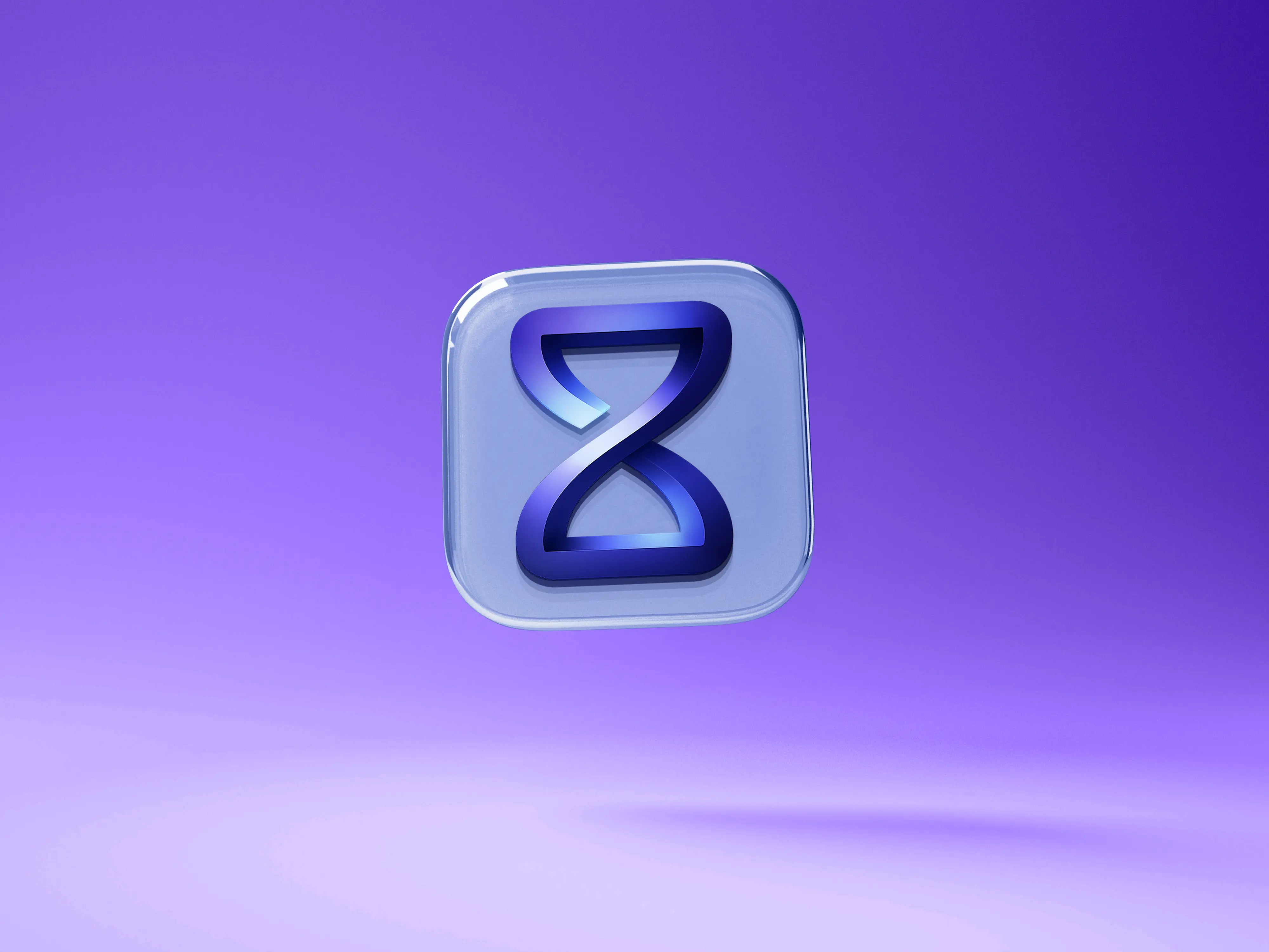
The logo reflects that direction: a simple mark read as both an hourglass (time saved) and an infinity symbol (boundless potential). Drawn with continuous curves and softened angles, it remains clear at small sizes and suits interface use. I delivered the vector master and clear-space rules, solid and gradient variants, a square app icon, and a volumetric version for hero visuals and mockups.
The logo reflects that direction: a simple mark read as both an hourglass (time saved) and an infinity symbol (boundless potential). Drawn with continuous curves and softened angles, it remains clear at small sizes and suits interface use. I delivered the vector master and clear-space rules, solid and gradient variants, a square app icon, and a volumetric version for hero visuals and mockups.
The logo reflects that direction: a simple mark read as both an hourglass (time saved) and an infinity symbol (boundless potential). Drawn with continuous curves and softened angles, it remains clear at small sizes and suits interface use. I delivered the vector master and clear-space rules, solid and gradient variants, a square app icon, and a volumetric version for hero visuals and mockups.

WHAT I DID
WHAT I DID
WHAT I DID
On the print side, I designed the business cards through several iterations. Early proposals were too demonstrative and effect-driven; feedback sessions with the team led to a more restrained version that foregrounds the symbol and clarifies the information hierarchy. The final result features precise layout, measured use of gradients, and immediate readability of contact details tailored for real-world use.
On the print side, I designed the business cards through several iterations. Early proposals were too demonstrative and effect-driven; feedback sessions with the team led to a more restrained version that foregrounds the symbol and clarifies the information hierarchy. The final result features precise layout, measured use of gradients, and immediate readability of contact details tailored for real-world use.
On the print side, I designed the business cards through several iterations. Early proposals were too demonstrative and effect-driven; feedback sessions with the team led to a more restrained version that foregrounds the symbol and clarifies the information hierarchy. The final result features precise layout, measured use of gradients, and immediate readability of contact details tailored for real-world use.


WHAT I DID
WHAT I DID
WHAT I DID
Beyond the deliverables, the project taught me to structure my process and to collaborate effectively with internal clients. I documented each decision, articulated visual trade-offs, and organized approvals to keep a fast iteration pace without losing the big picture. By the end of the internship, the identity was established, the key assets were produced, and the brand had a coherent, extensible system that is immediately recognizable on screen and in print.
Beyond the deliverables, the project taught me to structure my process and to collaborate effectively with internal clients. I documented each decision, articulated visual trade-offs, and organized approvals to keep a fast iteration pace without losing the big picture. By the end of the internship, the identity was established, the key assets were produced, and the brand had a coherent, extensible system that is immediately recognizable on screen and in print.
Beyond the deliverables, the project taught me to structure my process and to collaborate effectively with internal clients. I documented each decision, articulated visual trade-offs, and organized approvals to keep a fast iteration pace without losing the big picture. By the end of the internship, the identity was established, the key assets were produced, and the brand had a coherent, extensible system that is immediately recognizable on screen and in print.

RELATED PROJECTS

RELATED PROJECTS
I-ACTIV
VISUAL IDENTITY, MOTION DESIGN, AND WEB SUPPORT
During my internship at I-Activ, an AI-focused company, I worked as the in-house designer alongside the director—my brother—in a high-trust, high-standards setting. I led the brand’s visual identity end to end, from early research to deployment across print, motion, and web.
MY WORK
Branding
Print Design
UI/UX
SOFTWARE USED