LEROY AVOCAT
BRAND IDENTITY FOR LEROY AVOCAT
The visual identity of Leroy Avocats law firm stems from a personal story: that of the client's grandfather, a watchmaker. We chose to honor this family heritage through a discreet yet meaningful element: the oscillating weight of a mechanical watch. This component, which drives the perpetual movement of the clock, also symbolizes the dynamism and constancy required in the legal profession.
MY WORK
Brand identity
Print Design
SOFTWARE USED


WHAT I DID
WHAT I DID
WHAT I DID
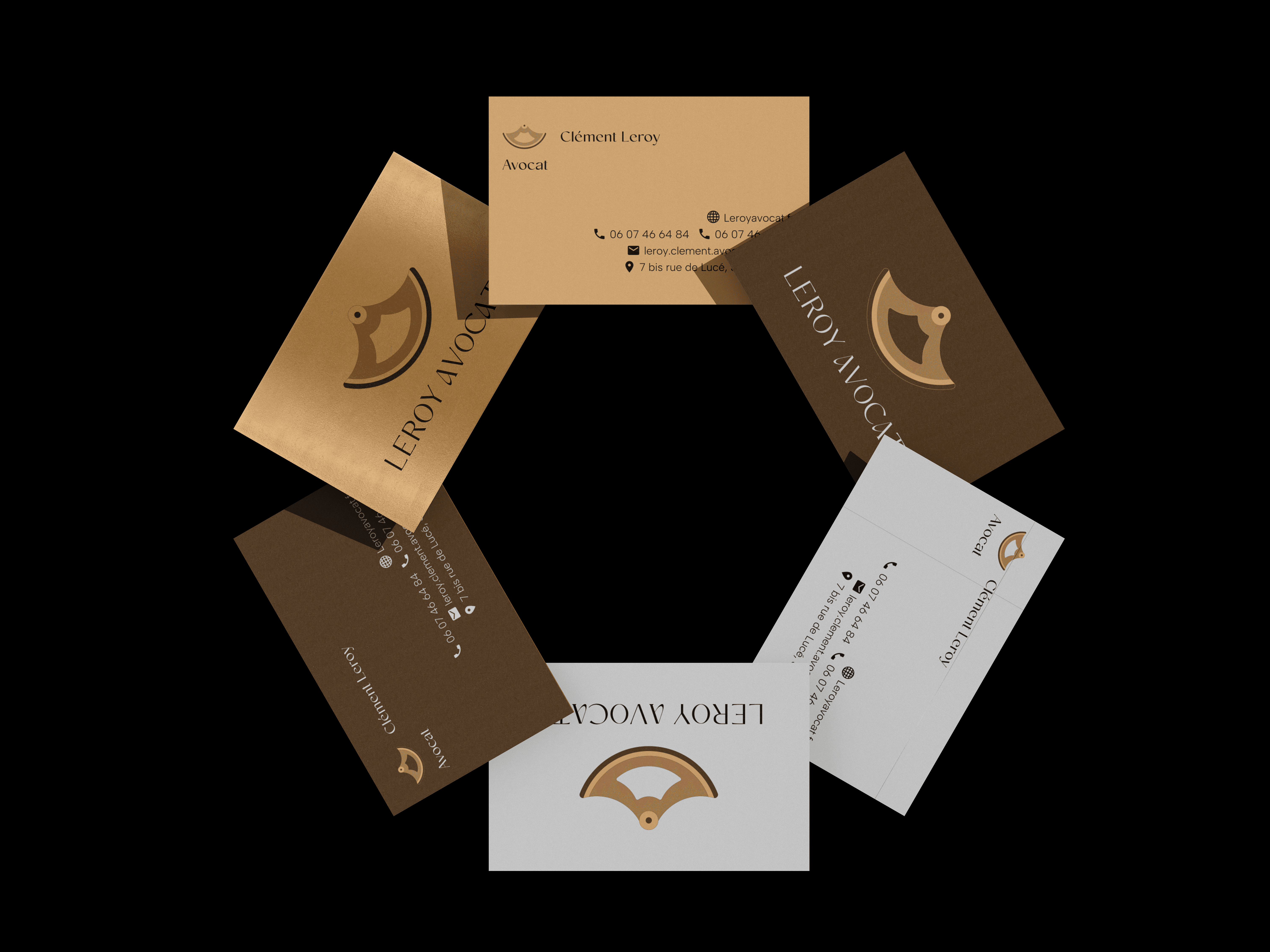
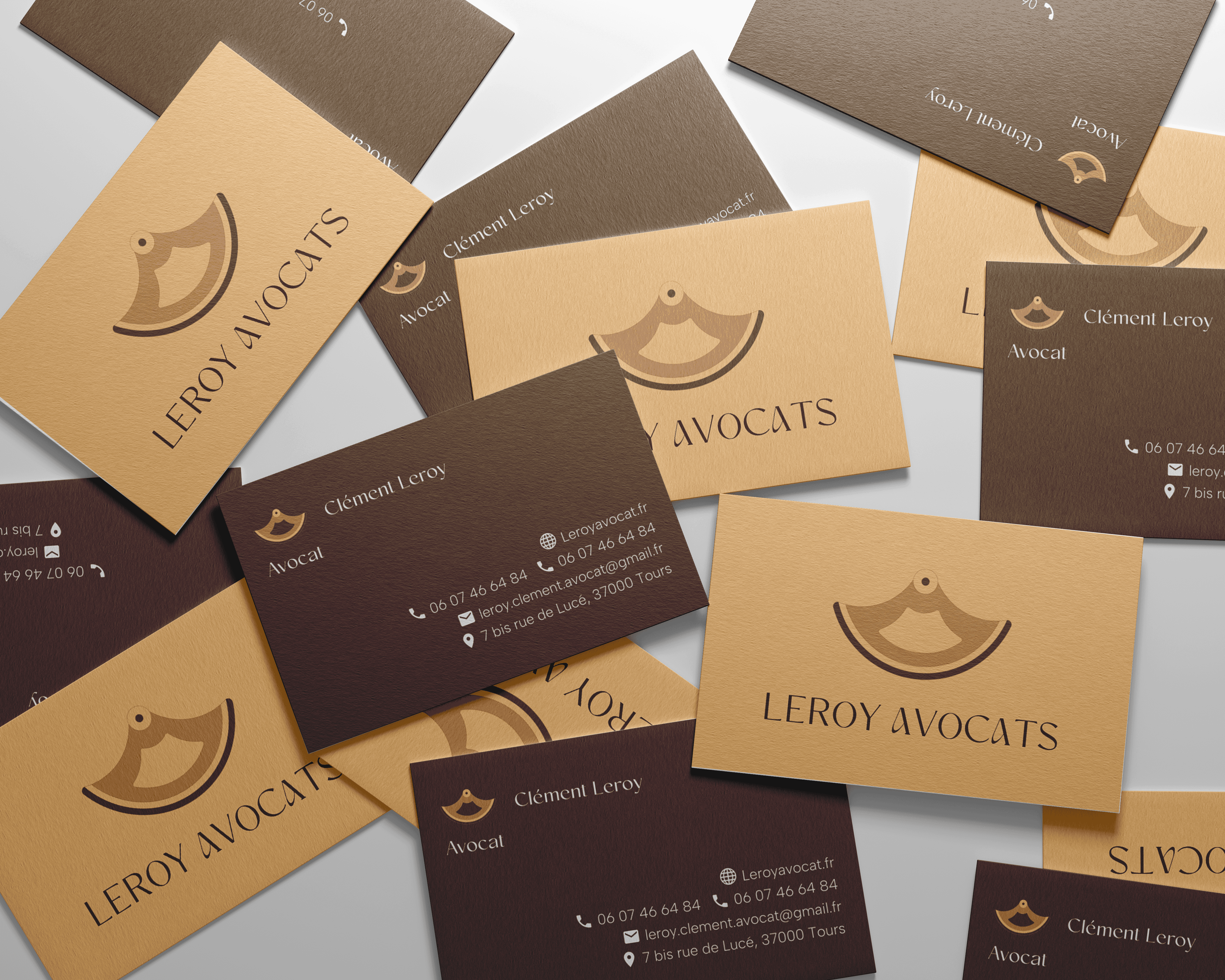
The oscillating weight was represented in a stylized manner, viewed from the reverse side of the mechanism rather than the dial, to bring a touch of uniqueness. The circular shape naturally evokes a watch dial while remaining refined and discreet. For the color palette, we opted for golden, beige, and brown tones that recall traditional watchmaking materials. These warm and sober hues convey an image of understated luxury and professionalism, in line with the law office environment.
The oscillating weight was represented in a stylized manner, viewed from the reverse side of the mechanism rather than the dial, to bring a touch of uniqueness. The circular shape naturally evokes a watch dial while remaining refined and discreet. For the color palette, we opted for golden, beige, and brown tones that recall traditional watchmaking materials. These warm and sober hues convey an image of understated luxury and professionalism, in line with the law office environment.
The oscillating weight was represented in a stylized manner, viewed from the reverse side of the mechanism rather than the dial, to bring a touch of uniqueness. The circular shape naturally evokes a watch dial while remaining refined and discreet. For the color palette, we opted for golden, beige, and brown tones that recall traditional watchmaking materials. These warm and sober hues convey an image of understated luxury and professionalism, in line with the law office environment.


WHAT I DID
WHAT I DID
WHAT I DID
The identity is deployed across all the firm's communication materials: business cards with two-tone finishes (cream beige and dark brown), exterior signage, door plaques, and wayfinding systems. This flexibility allows the firm to have an elegant and recognizable presence, whether in physical space or on digital media.
The identity is deployed across all the firm's communication materials: business cards with two-tone finishes (cream beige and dark brown), exterior signage, door plaques, and wayfinding systems. This flexibility allows the firm to have an elegant and recognizable presence, whether in physical space or on digital media.
The identity is deployed across all the firm's communication materials: business cards with two-tone finishes (cream beige and dark brown), exterior signage, door plaques, and wayfinding systems. This flexibility allows the firm to have an elegant and recognizable presence, whether in physical space or on digital media.

WHAT I DID
WHAT I DID
WHAT I DID
The result is a visual identity that stands out from the usual graphic codes of the legal sector by telling an authentic personal story. The watchmaking reference brings symbolic depth that resonates with the firm's values: precision, rigor, and transmission. The ensemble creates a professional and warm image that humanizes the firm while asserting its seriousness and expertise.
The result is a visual identity that stands out from the usual graphic codes of the legal sector by telling an authentic personal story. The watchmaking reference brings symbolic depth that resonates with the firm's values: precision, rigor, and transmission. The ensemble creates a professional and warm image that humanizes the firm while asserting its seriousness and expertise.
The result is a visual identity that stands out from the usual graphic codes of the legal sector by telling an authentic personal story. The watchmaking reference brings symbolic depth that resonates with the firm's values: precision, rigor, and transmission. The ensemble creates a professional and warm image that humanizes the firm while asserting its seriousness and expertise.
RELATED PROJECTS


RELATED PROJECTS
LEROY AVOCAT
BRAND IDENTITY FOR LEROY AVOCAT
The visual identity of Leroy Avocats law firm stems from a personal story: that of the client's grandfather, a watchmaker. We chose to honor this family heritage through a discreet yet meaningful element: the oscillating weight of a mechanical watch. This component, which drives the perpetual movement of the clock, also symbolizes the dynamism and constancy required in the legal profession.
MY WORK
Brand identity
Print Design
SOFTWARE USED